Website design concepts 2.0: a symbiosis of technology, business & UX
August 17, 2023

August 17, 2023

Picture yourself in the midst of an exciting process, meticulously planning your dream kitchen. You know exactly what you want: an elegant island with sleek, high-gloss fronts, equipped with cutting-edge appliances. But that’s not all: You also want your kitchen to optimally utilize every inch of available space. So where do you start? Like many, you’d likely start by looking for inspiration online. However, that’s often easier said than done. After all, an unbalanced website design can make your search more frustrating than enjoyable.

Get expert advice now!
At valantic, we have learnt over the years where the pitfalls lie and are happy to give you an insight into the art of creating user-centric website design concepts.
Myth 1: Users will understand how it works.
Many website operators fall into the trap of assuming that users will effortlessly find their way around. However, an intuitive user interface doesn’t come about by happenstance; instead, it requires careful planning and ongoing assessment. By embracing an iterative design approach along with user testing, we can make sure that website visitors are spared the need for guesswork when crafting and personalizing their kitchen design.
Myth 2: Everything has to be on the home page.
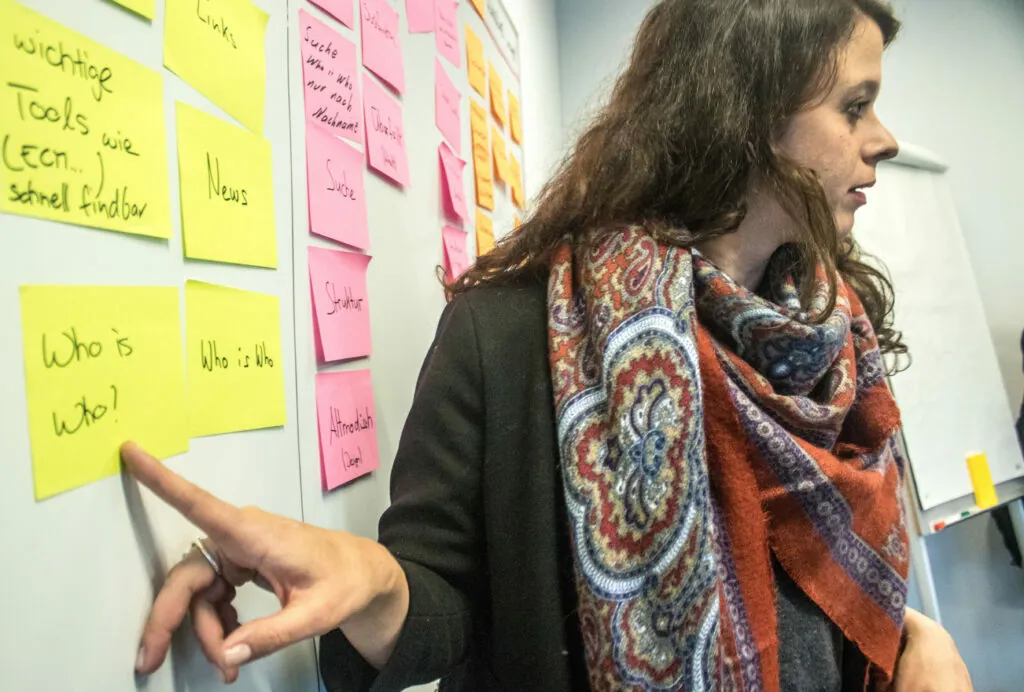
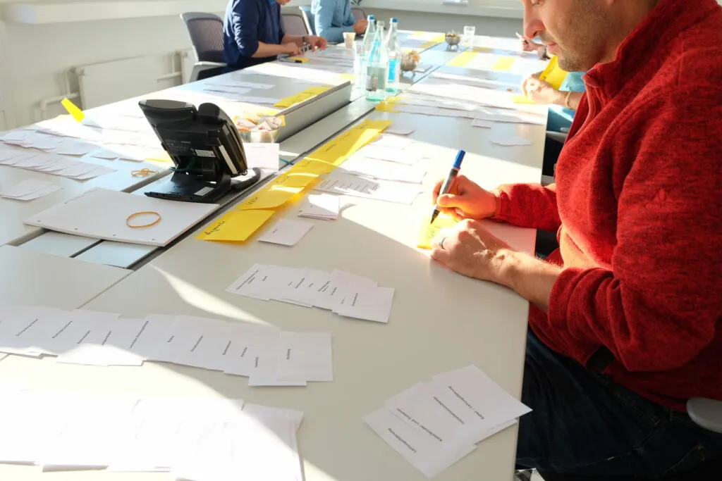
It can be tempting to put all the information on the home page, but this often results in bombarding users with an avalanche of information. That’s why a well-organized information architecture and streamlined design are vital. They help users locate what they need – sans the confusion. To achieve this, we use methods such as card sorting to find out where users expect to find certain menu items.
Myth 3: UX design is just aesthetics.
Many people mistake UX design for superficial interface design. However, its scope is much wider. It encompasses the entire user experience, spanning from website speed to customer support quality. At valantic, we take a holistic stance on UX and ensure that every interaction users have with the website is positive and seamless. Our approach is not limited to surface-level design; we assist our clients in streamlining their processes to drive innovation from within – from marketing to logistics to customer service.
Myth 4: Once built, the website always works.
There’s a common misconception that a website, once developed, runs seamlessly on its own. However, the truth is: Maintaining an online presence requires ongoing attention and refinement. That’s why we are dedicated to the perpetual optimization of our clients’ projects. This commitment ensures that the website always remains up to date with the latest technology and meets the evolving needs of users.

There’s a common misconception that a website, once developed, runs seamlessly on its own. However, the truth is: Maintaining an online presence requires ongoing attention and refinement. That’s why we are dedicated to the perpetual optimization of our clients’ projects. This commitment ensures that the website always remains up to date with the latest technology and meets the evolving needs of users.
What makes a perfect website design concept – from a UX point of view?
An optimal website design concept emerges from the harmonious interplay of UX, technology, and marketing. The objective is clear: deliver an online experience that’s not just smooth and enjoyable but ultimately also successful. To achieve this, we’ve established five strategic steps that guide us in crafting such a user-centric concept.
1. Understanding the target group
First, we need to understand who the users are and what they need or want. Via interviews, surveys, and data analysis, we’ll develop personas that help us understand their needs, preferences and behaviours. Too often, the target group is simply defined as “everyone”, but it makes a difference whether a design-savvy young woman or an older conservative gentleman is planning a kitchen. They will approach the planning process drastically differently, underscoring the significance of early incorporation of these use cases in the design of the website.
2. Information architecture
Building upon our understanding of the target group, we’ll determine how information should be presented on the website. This could mean, for example, that we design a kitchen planner tool that helps tech-savvy users to visualize their ideas. Conversely, for the more conservative target group, we could create a question-based assistant that finds the right appliance for them based on the desired features.
3. Prototyping and user testing
Once we have a preliminary structure in place, we’ll create prototypes and subject them to volunteer testing. This step allows us to identify problems right away and improve upon the design. Early testing proves cost-effective in the long run, as it helps uncover issues before they cause additional expenses.
4. Technical implementation
Having progressed to this stage of development, we unite UX and technology. We meticulously consider SEO and performance, crafting a website that boasts both user-friendliness and powerful technical capabilities.
5. Constant optimization
Even post-launch, the work doesn’t stop. We continuously improve the website through ongoing monitoring and A/B testing. This dynamic approach serves two key objectives: catering to user needs and achieving predefined business objectives.

Speaking of business goals: A successful website design concept encompasses more than just an appealing design and user-friendly interface. Attainment of quantifiable objectives is crucial as well. While user-centricity remains paramount, it’s important to recognize that prioritizing users doesn’t mean that business goals have to take a back seat.
We’ll collaboratively establish well-defined KPIs with our clients right from the outset. These metrics serve as benchmarks to gauge the website’s success. They encompass variables such as the desired number of leads, the conversion rate and the dwell time on the site. Regular monitoring and data analysis allow us to show our clients how the website is performing and what needs to be done to achieve the set goals. This way, we can ensure that our design concepts are not only visually appealing but also offer tangible (and measurable!) added value for our clients.
To give you an example: A kitchen planning tool needs to be user-friendly but at the same time offer opportunities for up-selling and cross-selling, without inundating users. It is also very important to include business stakeholders and the marketing department right from the start. Otherwise, useful features might fall by the wayside due to tensions between the various parties involved.

Consistent communication and collaboration among business stakeholders, developers and UX experts is crucial. This synergy ensures that a website is both helpful to users and beneficial to business outcomes.
Collectively, we can achieve more. After all, developing the ideal website design concept is an art as much as it is a science. It’s all about understanding users and creating an experience that is tailored to their needs. At valantic CX, we embrace this challenge with open arms and look forward to continuing to craft exceptional website designs. Want to work with us on bringing your innovative digital kitchen planning tool to life?

Let’s get started right away!
Would you like to learn more about our website design approach and how we can help you achieve your goals? Fill in our contact form to book a non-binding discovery…
Don't miss a thing.
Subscribe to our latest blog articles.